Ugly on Purpose: Why the Messiest Designs Are Winning the Internet Right Now
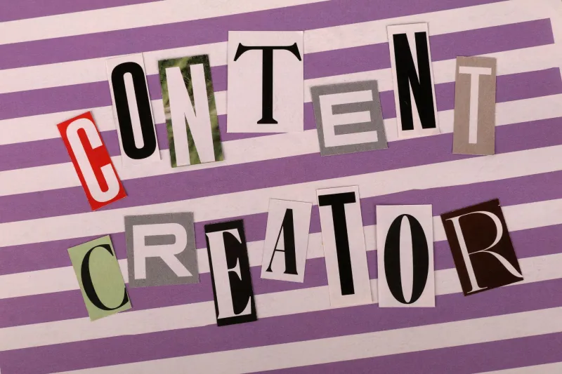
There's a particular kind of website that's been catching eyes lately. Not because it's beautiful — at least not in the way a Squarespace template is beautiful — but because it looks like it was built at 2 a.m. by someone who genuinely did not care what your design school professor thinks. Clashing colors. Overlapping text. Fonts that seem pulled from a 1998 GeoCities fever dream. And yet, somehow, it works.
Welcome to the deliberate ugliness movement. It's loud, it's jarring, and it might be the most honest thing happening in digital design right now.
The Tyranny of Clean
For years, the visual language of the internet was basically handed down from on high by a handful of Silicon Valley companies. Apple made minimalism the default religion. Airbnb, Spotify, and every VC-backed startup followed suit — same sans-serif fonts, same soft gradients, same whitespace-as-luxury vibe. The whole aesthetic said: we are trustworthy, we are modern, we have been optimized.
And sure, it looked good. But it also started to feel like nothing. Every brand began blurring into the same beige blob of corporate approachability. A skincare startup looked like a fintech app looked like a meditation platform looked like a meal kit delivery service. The polish became its own kind of lie — a visual promise of frictionlessness that had nothing to do with actual human experience.
Designers noticed. Then audiences noticed. And then, somewhere in the cultural metabolism of the internet, something snapped.
Breaking the Grid on Purpose
The backlash didn't arrive as a manifesto. It arrived as a vibe. Indie musicians started releasing albums with covers that looked deliberately degraded — pixelated portraits, hand-drawn lettering, scanned textures that felt like they'd been through a printer three times too many. Small brands started building websites that rejected the clean scroll-down-and-convert format entirely, opting instead for chaotic, non-linear layouts that made you work to understand them.
Design studios like Linked by Air and experimental collectives scattered across Brooklyn and LA began treating asymmetry not as a mistake but as a flex. Typography got aggressive — oversized, underlapping, sometimes literally illegible. Color palettes swung toward combinations that a conventional brand strategist would call "hostile."
This wasn't incompetence. It was refusal. A deliberate rejection of the visual grammar that had come to represent algorithmic conformity.
"There's something deeply political about making something that doesn't try to please everyone," one independent designer based in Philadelphia told a design forum last year. "When everything is optimized for conversion, ugliness becomes a form of honesty."
Why Gen Z Is Eating This Up
Here's the thing about growing up chronically online: you develop an almost preternatural sensitivity to when something is performing authenticity versus actually being authentic. Gen Z, more than any generation before them, has been marketed to in the language of realness — brands co-opting lo-fi aesthetics, corporations hiring TikTok-savvy social media managers to seem relatable, influencers performing vulnerability as content strategy.
The result is a generation that's deeply skeptical of polish. When something looks too good, too considered, too optimized — it reads as fake. Conversely, when something looks rough, unfinished, or visually confrontational, it signals that whoever made it wasn't trying to manipulate you into a purchase. They were just making something real.
This is why underground zine culture has exploded again. Why Risograph printing — with its misregistered colors and slightly blurry edges — has become the preferred medium for a whole wave of artists and small publishers. Why Depop shops run by teenagers have branding that looks like it was made in MS Paint, and somehow that's exactly the point.
There's also a class dimension worth naming. Hyper-polished design costs money — agency fees, licensed fonts, professional photography. Ugly design, by contrast, is accessible. It levels the playing field. A kid with a cracked laptop and a free trial of some obscure design tool can make something that competes aesthetically with a well-funded brand, precisely because the aesthetic isn't about production value anymore.
The Brands That Got the Memo
Some labels and companies have clocked this shift and started leaning in — though the results are mixed. When a major corporation tries to do "ugly" design, it often lands with a thud, because the whole point of the aesthetic is that it can't be faked at scale. You can't A/B test your way to genuine visual chaos.
But the brands that have done it well tend to be smaller, more culturally embedded operations. Independent record labels. Art book publishers. Streetwear brands that started as passion projects. These are organizations where the design is actually an extension of the people making it, not a strategic positioning exercise.
Museum of Arts and Design in New York caused a minor stir a couple years back when they debuted a rebrand that leaned heavily into visual tension — competing typefaces, deliberately unresolved layouts. Critics were divided. Audiences, particularly younger ones, found it electric.
Visual Friction as Resistance
There's a deeper idea buried in all of this, and it's worth pulling out. The sterile, optimized aesthetic of mainstream digital design isn't just an aesthetic choice — it's an ideology. It says that the purpose of design is to remove friction, to smooth the path from attention to action, to make you click and buy and scroll without ever quite noticing you're being guided.
Ugly design refuses that contract. It reintroduces friction deliberately. It says: slow down, actually look at this, decide for yourself what you think. In a digital environment engineered to hijack your attention and funnel it toward predictable outcomes, that friction is almost radical.
When a pixelated logo stops you mid-scroll because it looks wrong, that moment of hesitation is the whole point. You've been forced into an actual encounter with the thing, rather than a seamless consumption of it.
The Aesthetic Isn't Going Anywhere
Some critics will argue that deliberate ugliness is just another trend, destined to be absorbed and commodified the moment it hits a certain mainstream threshold. And they're probably not wrong — trends have a way of eating themselves. But what feels different about this particular movement is that it's less about a specific visual style and more about a principle: that authenticity is worth more than optimization, and that audiences can tell the difference.
As long as the internet keeps churning out algorithmically approved perfection, there will be designers and creators who push back against it with deliberate, confrontational imperfection. The tools change. The platforms shift. But the impulse to make something that looks like a human being made it, rather than a committee approved it — that's not going anywhere.
Ugly, it turns out, has a very long shelf life.