Intentionally Wrong: How Artists Turned Visual Chaos Into the Ultimate Power Move
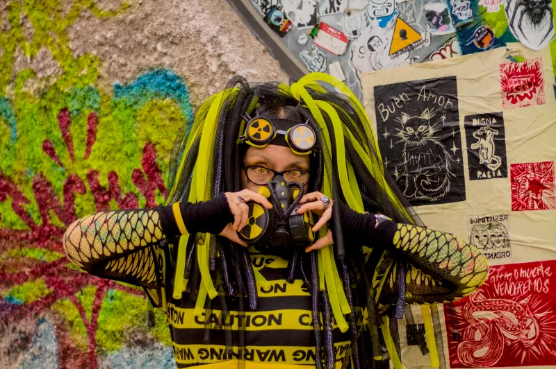
There's a poster circulating in certain corners of the internet right now. The font looks like it was chosen by someone who had never heard of fonts. The colors are fighting each other in a way that feels almost personal. The layout ignores every rule a design school has ever whispered into existence. And somehow — somehow — it's the coolest thing you've seen all week.
Welcome to the anti-aesthetic, where looking like you don't care is the most painstaking choice a creator can make.
The Paradox Nobody Wants to Talk About
Here's the uncomfortable truth sitting at the center of this whole conversation: the "I didn't try" look requires an enormous amount of trying. We're not talking about actual sloppiness. We're talking about a deeply considered, culturally fluent decision to reject the visual grammar that corporate design has spent decades normalizing — and to replace it with something that reads as raw, resistant, and real.
Think about the difference between a brand accidentally using Comic Sans and a Brooklyn-based independent zine choosing Comic Sans in 2024. One is a mistake. The other is a manifesto.
The anti-aesthetic isn't new — it has roots in Dada, in punk flyers, in the deliberately lo-fi xerox culture of the '80s underground. But something has shifted in the digital era. When every tool that makes things look polished is free, accessible, and built into your phone, choosing not to use those tools becomes a radical act. The polish is the default now. The roughness is the rebellion.
What "Wrong" Actually Communicates
When a creator drops a flyer with clashing neons, misaligned text, and a pixelated image that looks like it was screenshotted from a 2003 webpage, they're not making a mistake. They're sending a message to a very specific audience: I am not trying to sell you something. I am not optimized for your approval. I exist outside the system that trained you to trust clean lines and sans-serif fonts.
That's a lot of communication for a bad kerning choice.
Visual "wrongness" functions as a kind of credibility signal in underground and indie creative spaces. It's shorthand for authenticity in a media landscape so thoroughly colonized by brand aesthetics that anything too polished now reads as suspicious. We've been trained by decades of advertising to associate slick design with the desire to manipulate us. Rough edges, on the other hand, feel like something a real person made in a real room for reasons that weren't primarily financial.
Artists working in music, fashion, zine culture, and digital art have all picked up on this. Bands releasing music through Bandcamp with hand-scrawled cover art. Designers building entire visual identities around fonts that look like ransom notes. Illustrators deliberately flattening perspective in ways that violate every rule of spatial logic. It all reads the same way: this came from somewhere real.
The Algorithm Hates It (Which Is Exactly the Point)
There's another layer here that gets less attention: the anti-aesthetic is also a quiet act of sabotage against platform optimization culture.
Social media algorithms have spent years training creators to produce content that performs — that hits certain visual beats, uses certain color temperatures, maintains certain production values. The result is a feed that, no matter where you scroll, looks eerily similar. Everything is lit the same way. Everything uses the same handful of typefaces. Everyone's thumbnails follow the same emotional grammar.
Anti-aesthetic work breaks that visual contract on purpose. It doesn't play well with the algorithm because it wasn't built for the algorithm. And in creative communities that have grown deeply skeptical of platform logic, that refusal is its own form of prestige.
This is why you'll see the most deliberately "ugly" work coming from artists who already have cultural credibility — musicians, visual artists, and designers who don't need the algorithm's help because they've built audiences through actual community. The anti-aesthetic is, in part, a luxury of not being dependent on virality.
When Calculated Carelessness Gets Co-Opted
Predictably, the corporate world has started noticing. And predictably, it's a mess.
Brands trying to tap into anti-aesthetic credibility by mimicking the visual language of underground culture end up producing something that feels deeply wrong in a different way — not the interesting kind of wrong, but the uncanny valley kind. A multinational corporation using deliberately bad typography doesn't read as authentic resistance. It reads as a very expensive focus group's best guess at what resistance looks like.
The anti-aesthetic community can smell this from miles away. The whole point of visual "wrongness" as a credibility signal is that it costs something — it costs you the approval of mainstream audiences, the comfort of legibility, the safety of convention. When a brand adopts the aesthetic without paying that cost, the signal collapses. It becomes costume.
This is the eternal arms race of underground aesthetics and mainstream co-optation. The underground invents a new visual language to distinguish itself. The mainstream absorbs it. The underground mutates and moves on.
The Craft Inside the Chaos
What often gets missed in discussions about anti-aesthetic work is how technically sophisticated a lot of it actually is. Creating something that looks genuinely wrong — rather than just amateur — requires a deep understanding of what "right" looks like and why. You have to know the rules to break them in ways that feel intentional rather than accidental.
The best anti-aesthetic designers are, paradoxically, some of the most design-literate people in the room. They're making micro-decisions constantly: this clash is interesting, that one is just ugly. This misalignment creates tension, that one just creates confusion. There's a whole invisible craft happening inside the apparent chaos.
That's what separates the artists who are genuinely operating in this space from people who just didn't try. The former is a creative position with a philosophy behind it. The latter is just a bad poster.
What It All Means for the Rest of Us
If you're a creator watching this movement from the outside, the takeaway isn't "make your stuff look bad." The takeaway is that visual language is always communicating something beyond the literal content — and that the choice to reject dominant aesthetic norms is itself a statement about where you stand.
In a digital culture where everything is optimized and every surface is an ad, the deliberately unoptimized thing carries weight. It suggests a creator who has priorities beyond engagement metrics. It suggests work that exists because it needed to exist, not because it was engineered to perform.
And honestly? In 2024, that might be the rarest thing on the internet.